The Artifact is a long-form generative art collection generated by a single, relatively straightforward algorithm with the capacity to produce huge variation in outputs. This output variation can make it difficult to appreciate the collection as a whole and/or the meaning of individual pieces. You have to spend some time with the collection, looking at individual outputs one-by-one, to see common patterns and to recognize which outputs are special and which are more mundane. To help collectors find their way around The Artifact, I have here highlighted some of my own favorite outputs. I have limited myself to mostly one output per color palette (there are 14 distinct palettes in the collection), though for some palettes I had to display more than one output to cover the full range of the collection. I have grouped my presentation into palettes with light background, palettes with dark background, and special palettes that don't fit well into either of the first two categories.
Palettes with a light background
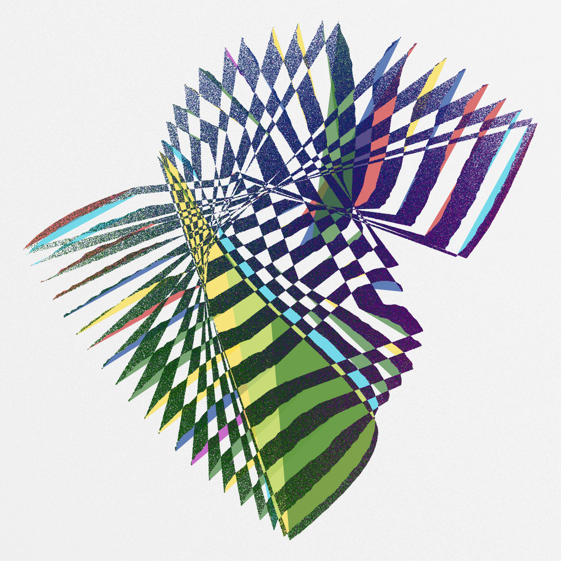
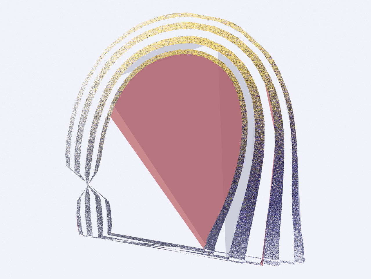
Let's start with the very first output minted, #1. I minted it by accident because I forgot to enable the token so I was the only person who could mint. It is a great first iteration. I like it particularly because it highlights the Shards-of-Blue heritage of The Artifact. The color palette is San Antonio, which has a unique story. It is one of the last palettes I added to the collection. Maxwell White saw some of my WIP outputs and asked if I could make a rainbow palette. My response was that I don't normally do rainbows. And then, more as a joke than being serious, I just quickly threw together a palette consisting of all three primary colors (red, green, blue) and all three secondary colors (yellow, magenta, cyan). But unexpectedly I really liked the outputs I got with this palette, and so I made it one of the most common ones in the collection. There are many really good outputs using this palette, certainly many more than I can highlight here in this article.
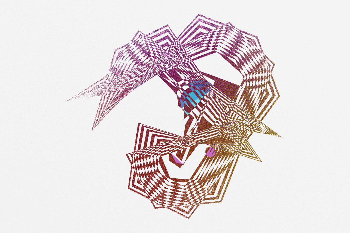
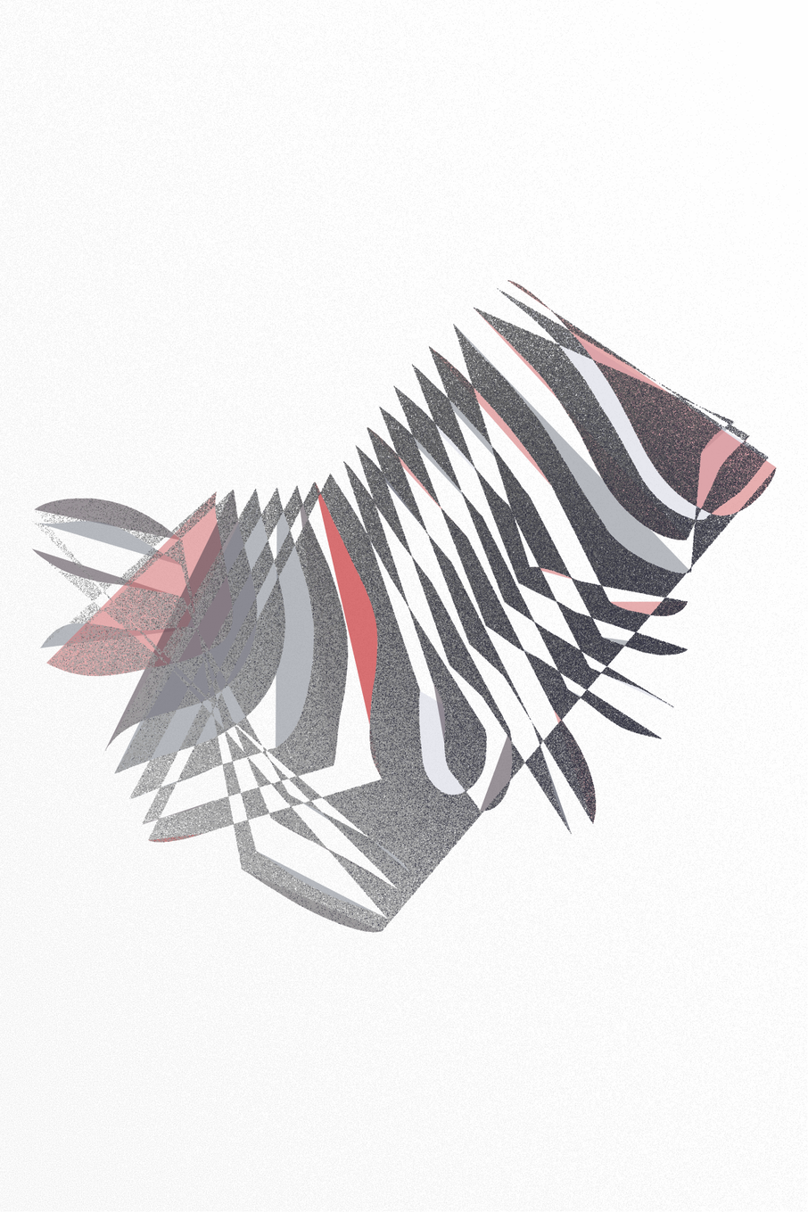
My second example of the San Antonio palette is #302, which to me looks like a dragon or a snake, maybe involved in a fight. The generative algorithm of The Artifact often produces images that look like animals, plants, or people, and this is a great example of this type of output. This particular output is also noteworthy because it has barely any first-layer filled polygons. The combination of first-layer filled polygons and second-layer stippled polygons creates the unique visual appearance of The Artifact outputs, but sometimes the first-layer polygons are nearly or entirely missing, resulting in a slightly different output character.
Now let's move on to the Trinity palette. It is the first palette I created for this series. I started with the color palette from Shards of Blue but wanted something warmer and more colorful. The iteration I have highlighted here demonstrates this quality well. It contains some nice warm yellows, oranges, and greens, all arranged in a spiral shape.
The Salt Fork palette is another warm and colorful palette, but with a stronger emphasis on red and yellow in the stippled layer than Trinity. Iteration #81 is one of the circular ones with a little jagged satellite. I like these outputs so much that I decided to pick one as the cover image for the entire collection. This particular one looks a bit like a skull in profile to me.
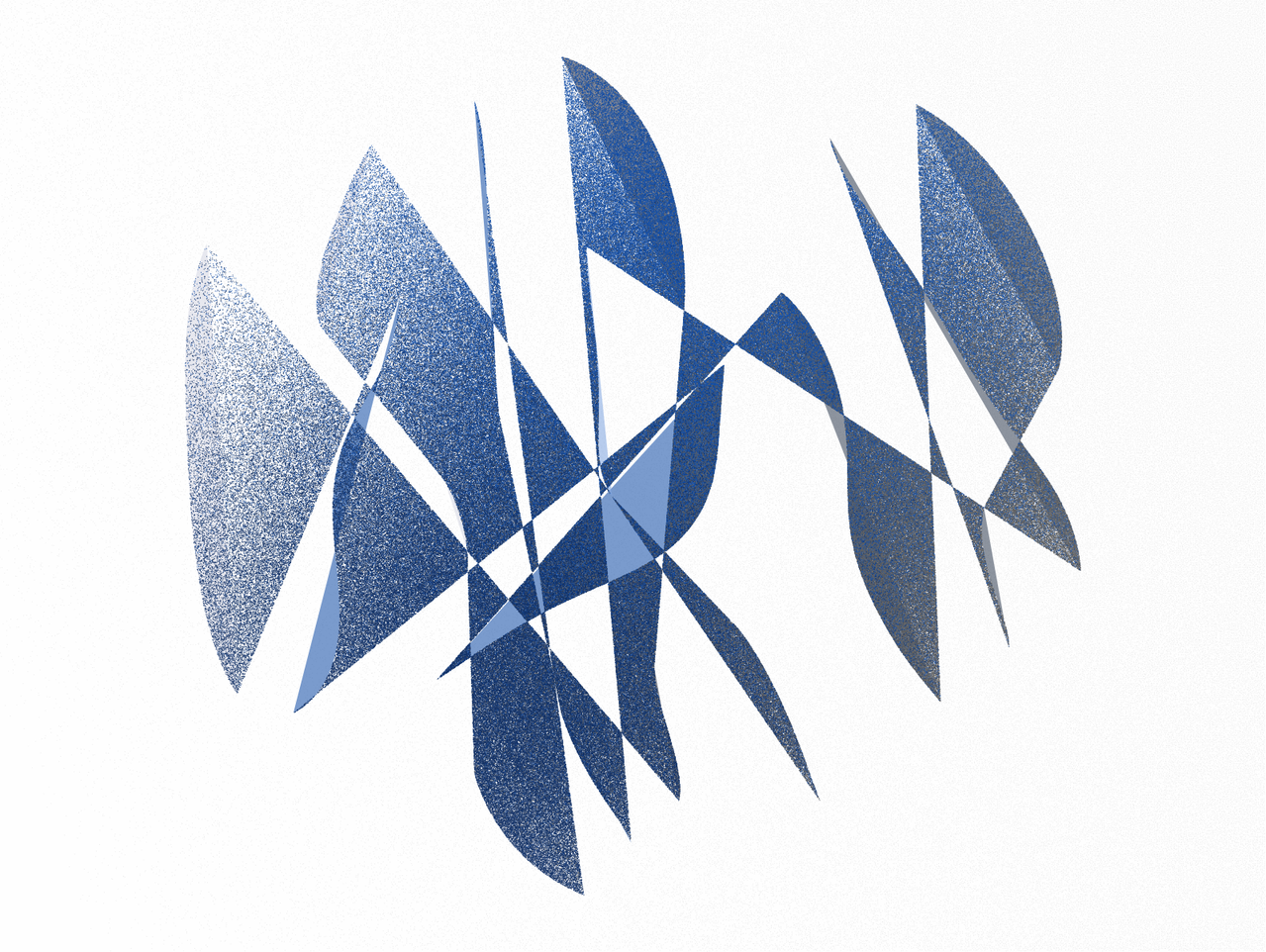
Now let's move on to the Rio Grande palette, which is a colder palette with an emphasis of blue and red tones. The iteration representing this palette is #382, which Bayamese called a "minimalist girl with a pearl earring."
The last two light palettes are Sabine and Nueces. They are both gray-scale palettes with one accent color, either red (Sabine) or blue (Nueces). The iteration representing Sabine is #183, which reminds me a bit of a fish. The iteration representing Nueces is #470, which makes me think of butterflies.
Palettes with a dark background
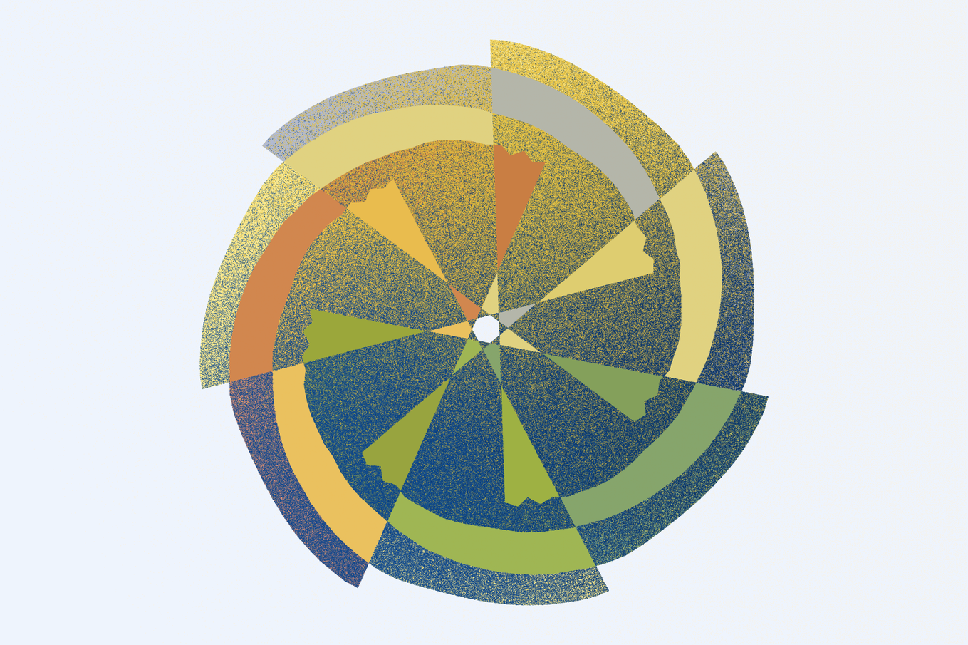
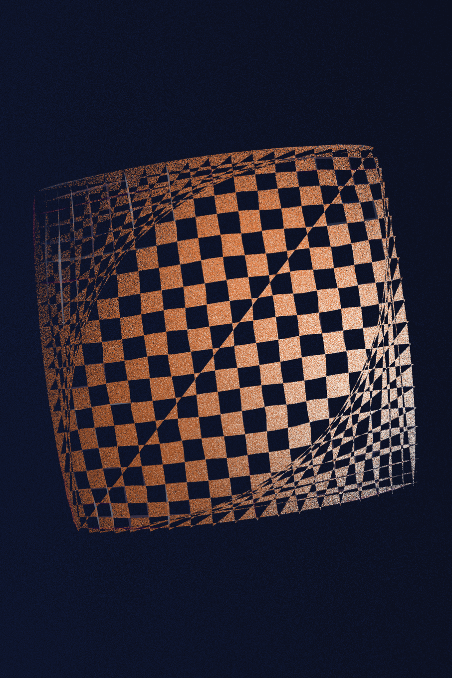
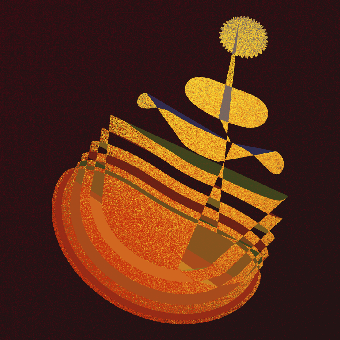
The first palette I created with a dark background, and the most abundant palette overall, is Guadalupe. It is characterized by strong orange and yellow tones that make its outputs look like copper or brass. The iteration I have chosen to highlight, #379, shows a nice, fairly regular grid. There are a handful of outputs of this type in the entire collection. They tend to arise when the input data is of type "grid" and the perplexity is fairly high, in excess of 20.
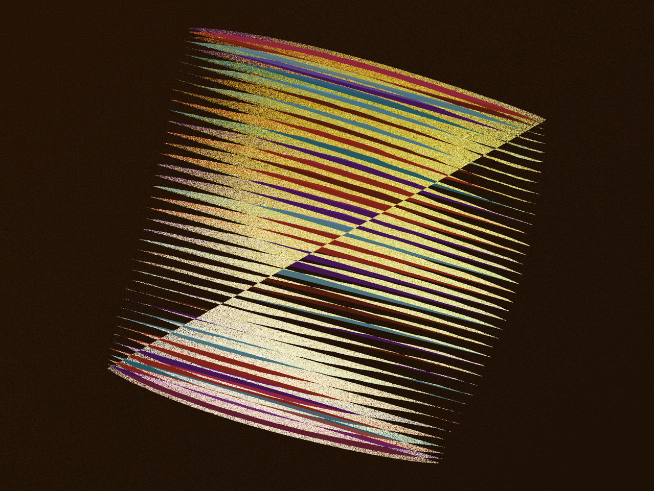
With the Pecos palette I went for stronger colors in the first layer polygons, specifically turquoise and red, with the colors in the second layer dominated by yellow and silver. The highlighted output is very characteristic for the overall collection, a Moiré pattern created by thin stripes in the first and second polygon layer that have different thicknesses and are somewhat shifted relative to each other. There are several outputs of this type in the entire collection, all with slightly different features and characteristics.
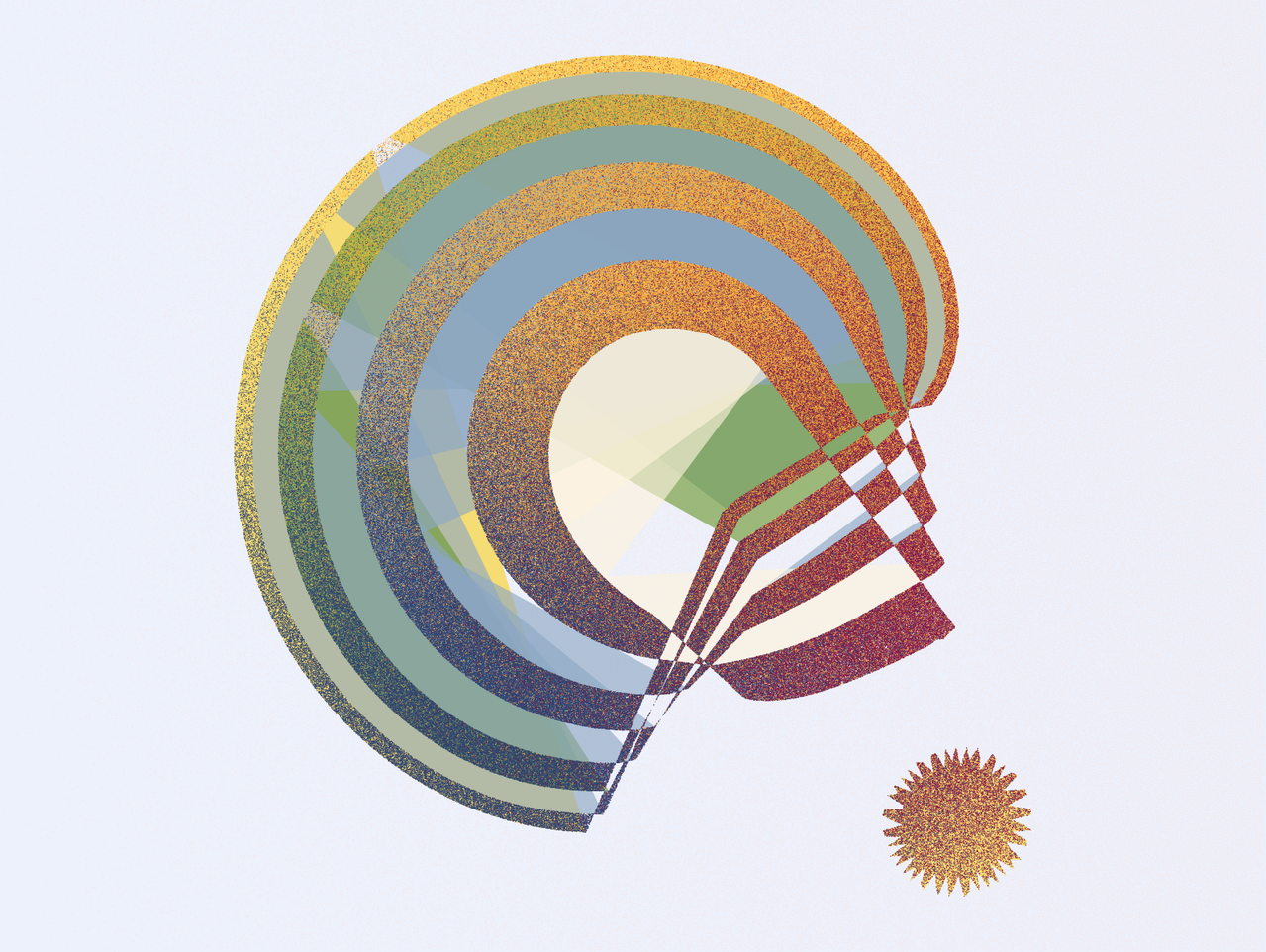
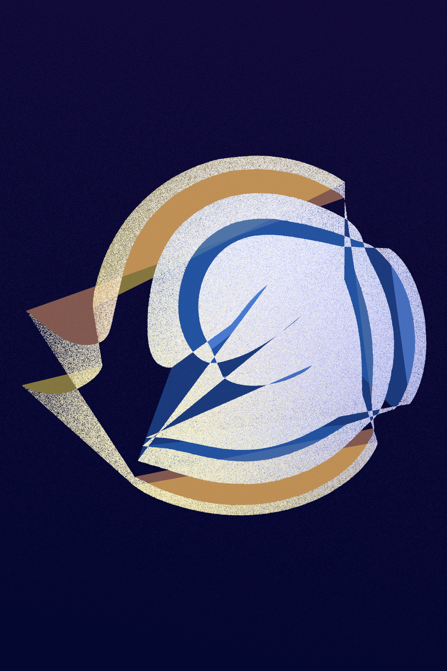
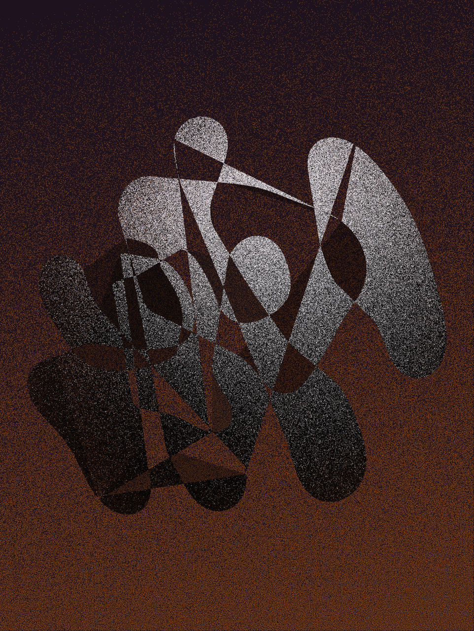
The Colorado palette is a colder palette, with an emphasis on blue, yellow, and white. From this palette I have selected iteration #428, which is unique in that it has an unusual shape for this generative algorithm. I find it striking for its large area of white and blue in the middle, with some orange and yellow towards the outside.
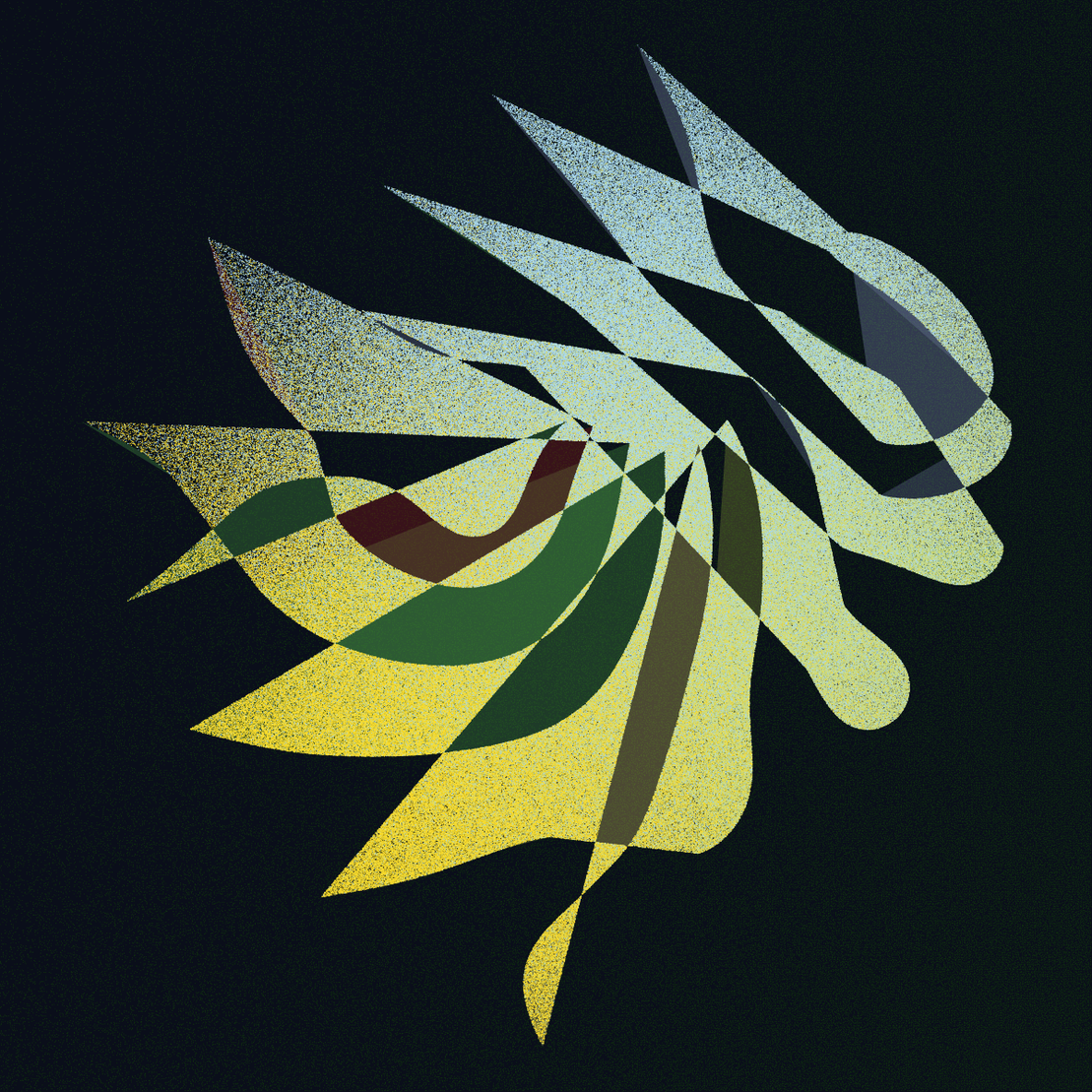
The San Marcos palette is characterized by greenish hues. To represent this palette I have selected iteration #59. I love this output, which looks to me like a ghost or other strange being racing to the right.
The Red River palette is mostly red. Iteration #122 in this palette displays beautiful bubbly shapes that rise upwards.
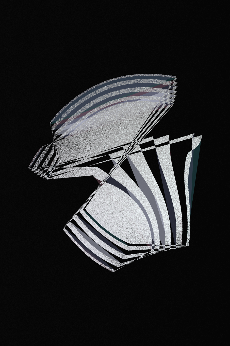
The final dark palette is Brazos, which is mostly black and silver, with a few muted olive and mauve tones. To represent this palette, I have chosen iteration #233, which reminds me a bit of The Alien in the original Shards of Blue collection.
Special palettes
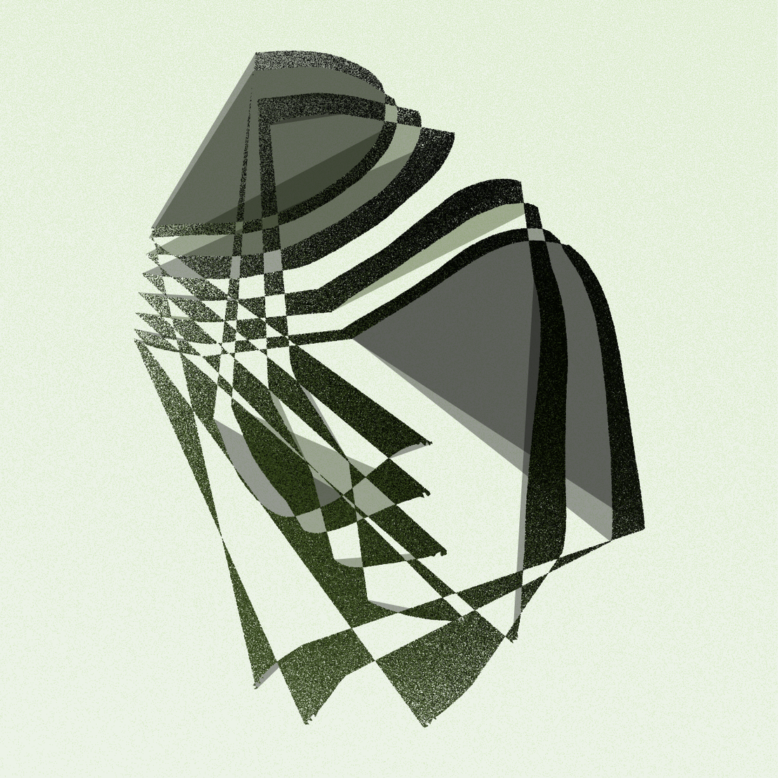
There are two special palettes that don't fit into the previous two categories. Both are relatively rare. The Lavaca palette uses a light green background and darker green and gray foreground colors. There are many truly unique outputs in the Lavaca palette. I encourage you to check them all out. Here, I am highlighting #33, which looks a bit like an infant sleeping on its back.
The second special palette is San Jacinto, and it uses a dark orange as background color and either very dark grays or dark grays and silver as foreground colors. Outputs in the San Jacinto palette can look very different depending on whether silver is present or not. Without any silver, the overall image may appear extremely dark. In thumbnail format, it can almost look like it's just a dark rectangle. However, if you open it in full screen and look at it for a while you will notice that it looks like a complex figure scratched into sand or stone. One of the best examples of this type is #267.
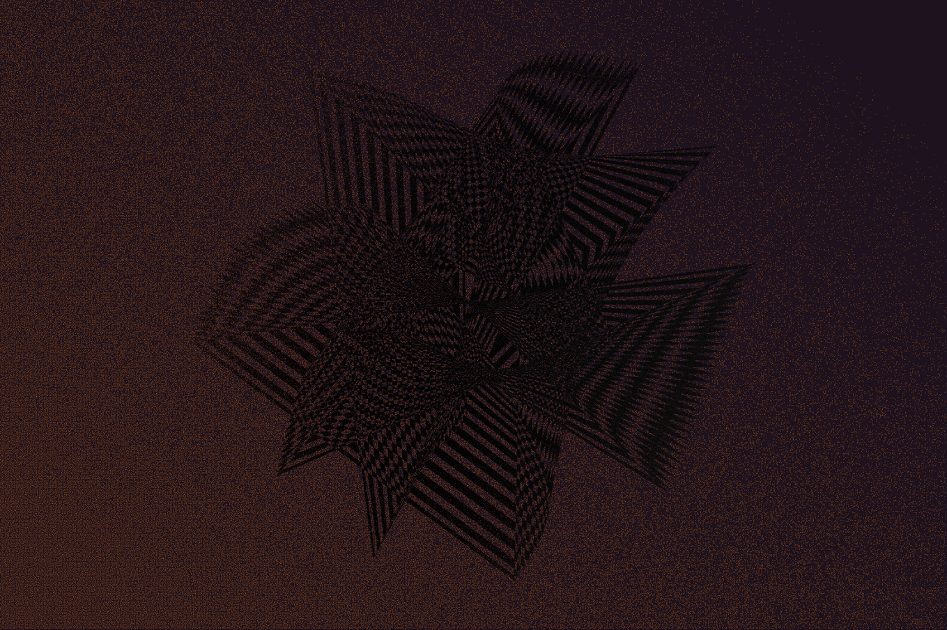
With silver, on the other hand, the foreground is much more distinct and almost glows against the background of dark orange.
This concludes my guided tour through The Artifact. I hope it has given you increased appreciation for some of the outputs. There are many more unique and exciting outputs than I could possibly highlight in a single article, so I hope you explore the collection and find your own favorites.